
Key takeaways
- A logo is one piece of a brand system. The system is what keeps every proposal, page and post looking and sounding like the same company.
- Recognition comes from assets that are both unique to you and widely seen. Changing them carelessly can cost real money.
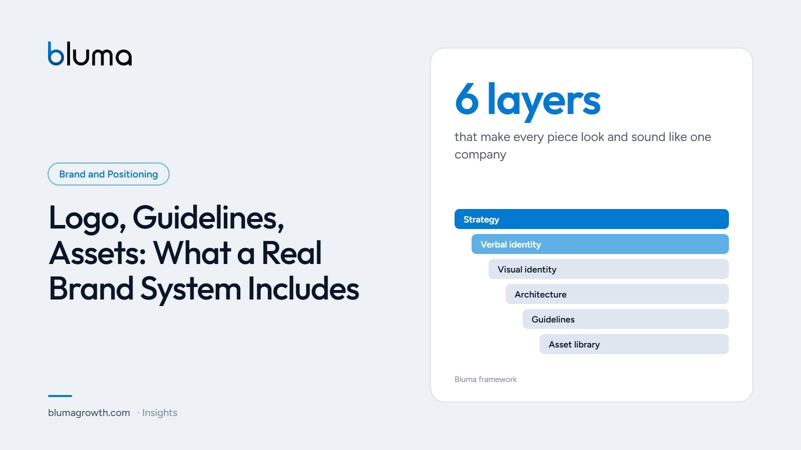
- A complete system has six layers: strategy, verbal identity, visual identity, brand architecture, guidelines and a working asset library.
- Roll it out where buyers look first: your website, proposals and Google profile, then everything else.
Many service firms have a logo, a color someone chose years ago and a folder of files nobody can find. Proposals are built from old templates, every salesperson describes the company differently and the website no longer matches the business card. None of this looks like a crisis. It just makes a good firm look smaller and less organized than it is.
A brand system fixes that. This article explains what one includes, why consistency pays and how to roll it out without stopping the business.
Why consistency pays
Lucidpress (now Marq) surveyed more than 450 organizations for its brand consistency report and found that consistent brand presentation was associated with revenue gains of 10% to 20%, while 60% of companies said they regularly deal with off-brand content. It is a vendor survey, so treat the exact range with care, but the pattern matches what buyers report: Siegel+Gale’s World’s Simplest Brands study found that 64% of people would pay more for simpler brand experiences and 78% are more likely to recommend brands that provide them.
Distinctive assets: unique and famous
Jenni Romaniuk of the Ehrenberg-Bass Institute, one of the most cited researchers on brand recognition, argues that a distinctive asset (a color, shape, symbol, phrase or character) is only valuable when it is both unique to your brand and famous, meaning widely linked to you. She proposes judging each asset on those two dimensions:
| Widely known | Not widely known | |
|---|---|---|
| Unique to you | Use or lose: protect and use everywhere | Invest: promising, needs consistent exposure |
| Shared with others | Avoid: it reminds people of competitors | Test or ignore: no value yet |
The same research warns about careless redesigns. Romaniuk’s analysis estimates that Tropicana’s 2009 packaging change, which removed familiar visual cues, cost the brand about $26.3 million in sales before it reverted. For a service firm the stakes are smaller, but the lesson is the same: evolve what people already recognize instead of discarding it.
What a complete brand system includes
| Layer | What it includes | Why it matters |
|---|---|---|
| Strategy | Positioning, target buyer, promise, personality | Every other decision follows from it |
| Verbal identity | Key messages, one-line description, tone of voice, naming rules | Your team describes the company the same way |
| Visual identity | Logo and its versions, color palette (HEX, RGB, CMYK), typography, photography style, icons | Recognition at a glance, on any screen or print |
| Brand architecture | How the company, service lines and any sub-brands relate and are named | Buyers understand your offer quickly |
| Guidelines | A practical manual with correct and incorrect uses | Consistency that does not depend on one person |
| Asset library | Templates for proposals, presentations, social posts, email signatures, documents and signage | The system is actually used day to day |
Adobe’s guidance on brand guidelines lists the same core elements: values, vision and mission, logo usage, color palette, typography, imagery and icons, and tone of voice. The difference between a manual that sits in a folder and a system that works is the last layer: ready-to-use templates.
Brand architecture for a service firm
Brand architecture is how your services are organized and named. Most service firms are best served by a single master brand with clearly named service lines, sometimes called a “branded house.” It concentrates recognition in one name and makes cross-selling natural. Separate sub-brands make sense only when audiences are truly different or when a line could be sold independently.
Run a 20-minute audit. Collect ten things a buyer might see: your homepage, a recent proposal, your Google profile, an invoice, a social post, an email signature and a presentation. Lay them side by side. Count how many logo versions, colors, fonts and descriptions of your company you find.
How to roll it out without stopping the business
- Start with strategy. Agree on positioning and key messages before anyone opens a design tool.
- Fix the highest-traffic touchpoints first. Website, proposal template and Google profile are what buyers see before they decide to talk to you.
- Build templates, not just rules. A proposal template that is easy to use beats a rule that says “use the correct font.”
- Brief the team. A 30-minute session on the one-line description and the main templates prevents months of drift.
- Review twice a year. Retire old files, update templates and check new materials against the guidelines.
See how consistent your brand looks from outside. The free Bluma assessment checks your message, your visual coherence and how you compare with two competitors.